
👾 Game Master
5/7/2023, 2:16:02 AM
Candlestick Graph
What is Candlestick Chart?
A candlestick chart shows a stock's price movements over a certain period (3 minutes, one hour, a day, or any time period!). It provides a visual representation of the stock's performance and can be used to make informed decisions about buying and selling the stock.

Graph source: https://datavizcatalogue.com/methods/candlestick_chart.html
Structure of Candlestick
The candlestick chart is made up of individual "candles," each representing a specific time, such as a day or an hour. Each candle displays four key pieces of information: the opening, closing, highest price, and lowest prices for that period of time (which are four very crucial indicators commonly found in many basic trading algorithms).
To read a candlestick chart, start by looking at the body of the candle (the box). The body represents the difference between the opening and closing prices. If the closing price exceeds the opening price, the body will be colored green or white, indicating a bullish trend. If the closing price is lower than the opening price, the body will be colored red or black, indicating a bearish trend. The top and bottom of the candle reveal the open and close prices (which correspond to which depend on the color).
Next, look at the wicks on the candle (the two vertical lines that extend from the top and bottom of the box). The upper wick represents the highest price reached during that period of time, while the lower wick represents the lowest price. The length of the wicks can provide insight into the volatility of the stock during that period. For example, a long upper wick may indicate that the stock was trading at a high price but then experienced a sell-off, while a long lower wick may indicate that the stock was oversold but then experienced a rebound.
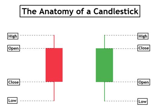
Graph source: https://www.vantagemarkets.com/academy/a-guide-to-candlestick-patterns/
Trading Indicators
To analyze a candlestick chart, traders often look for patterns or "signals" that can provide insight into the stock's future performance. Some commonly used candlestick patterns include the "bullish engulfing pattern," where a small red candle is followed by a large green candle, indicating a potential reversal from a bearish trend to a bullish trend. A visualization of the signal is shown below:
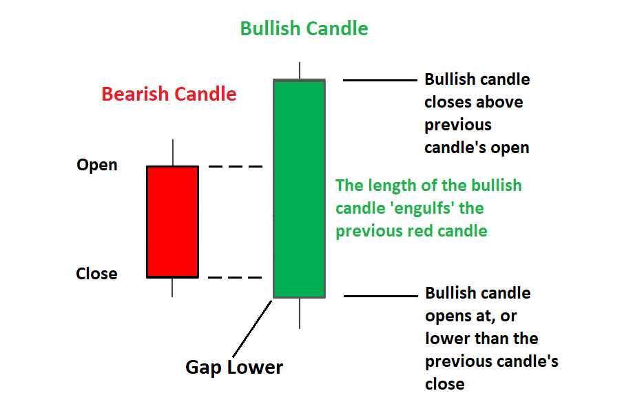
Graph source: https://www.dailyfx.com/education/candlestick-patterns/bullish-engulfing.html
Another pattern is the "doji," where the opening and closing prices are very close, indicating indecision in the market and a potential reversal. A visualization of the signal is shown below:
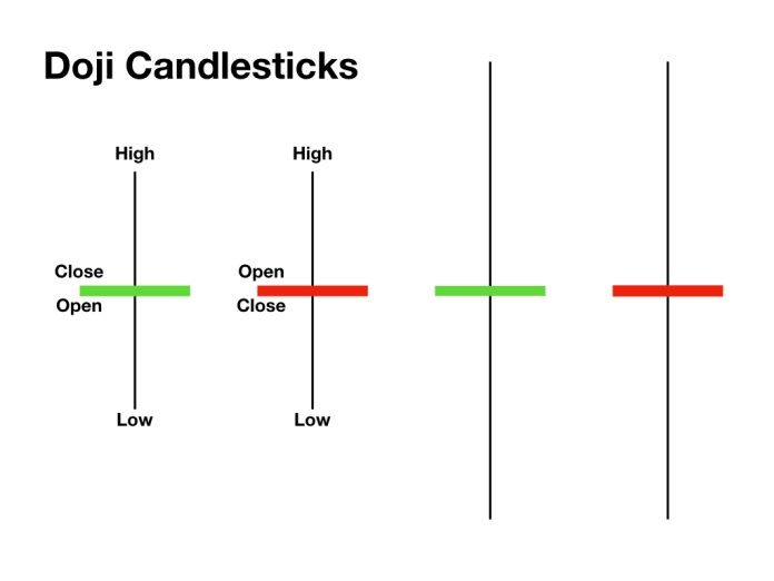
Graph source: https://iqtradingpro.com/doji-candlestick-patterns-how-to-identify-and-trade-in-iq-option/
Here are some other common signals:
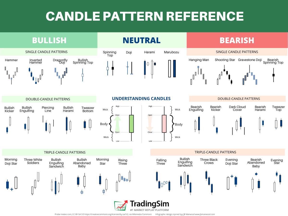
Graph source: https://tradingsim.com/blog/candlestick-patterns-explained
The candlestick chart is an important tool for traders and investors, as it visually represents a stock's performance over time. By analyzing the patterns and trends on the chart, traders can make informed decisions about buying and selling the stock. For example, if a trader sees a bullish pattern on the chart, they may buy the stock in anticipation of a price increase.
Conclusion
Overall, the candlestick chart is valuable for anyone interested in finance and stock trading. It provides a visual representation of a stock's performance over time and can be used to make informed decisions about buying and selling the stock. By analyzing the patterns and trends on the chart, traders can identify potential opportunities and risks and make informed decisions about when to enter or exit a position.